
 Recently, a friend of mine replied to a post asking me for more details about how I would analyze and mitigate risk in a business…. “the details are a little thin. As a former professor of business decision science, I would like to read more about the model building tools and techniques of how you do it.”
My reply was “That’s a great question Chris. As a blogger I try to not go into too much detail in these posts as most of my audience is relatively unfamiliar with concepts like Big Data, Business Intelligence Applications and Predictive Analytics. That said, I can think of a couple of ways to reply to your comment. I often say that Analytics is as much an art as it is a science. So, I will craft two blog response one for the artists and one for the scientists.” And then I will conclude with my own unique approach to analytics.
So yesterday we covered the science side, today lets look at the art side. They say a picture is worth 1000 words, well I agree and would take things further and say a good pie chart is worth 10000 rows of data. 🙂
Analytics as an art form is a more appealing to the average person, because most people don’t like math. They are afraid of having to use excel and rows and rows of data confuses them. This is why we have analytics, so people who do like math, numbers and excel can figure things out for the majority who don’t.
One of the big buzzwords going around right now is storytelling. Businesses need to engage customers in the way people are engaged by a good story. Marketing team are charged with connecting with an audience in the same way a great film maker or author does. And to do this, marketers have to be very good at getting their data and analytics to a point where it can tell that story.
Data visualization is one of the most powerful skills an analyst can use. Whether it be by using charts and graphs in excel, an info graphic or a business intelligence tool like Tableau that creates data visualizations; analysts can now be artists as much as scientists.
So what does this have to do with my friend Chris’s question about business decision science. It used to be that most decision were made after a long process of drafting requirements for the IT team, a long development cycle and static reporting put into place. However, that’s old school. Now good leaders and decision-makers access data themselves and do a lot of their analysis by playing around with the data.
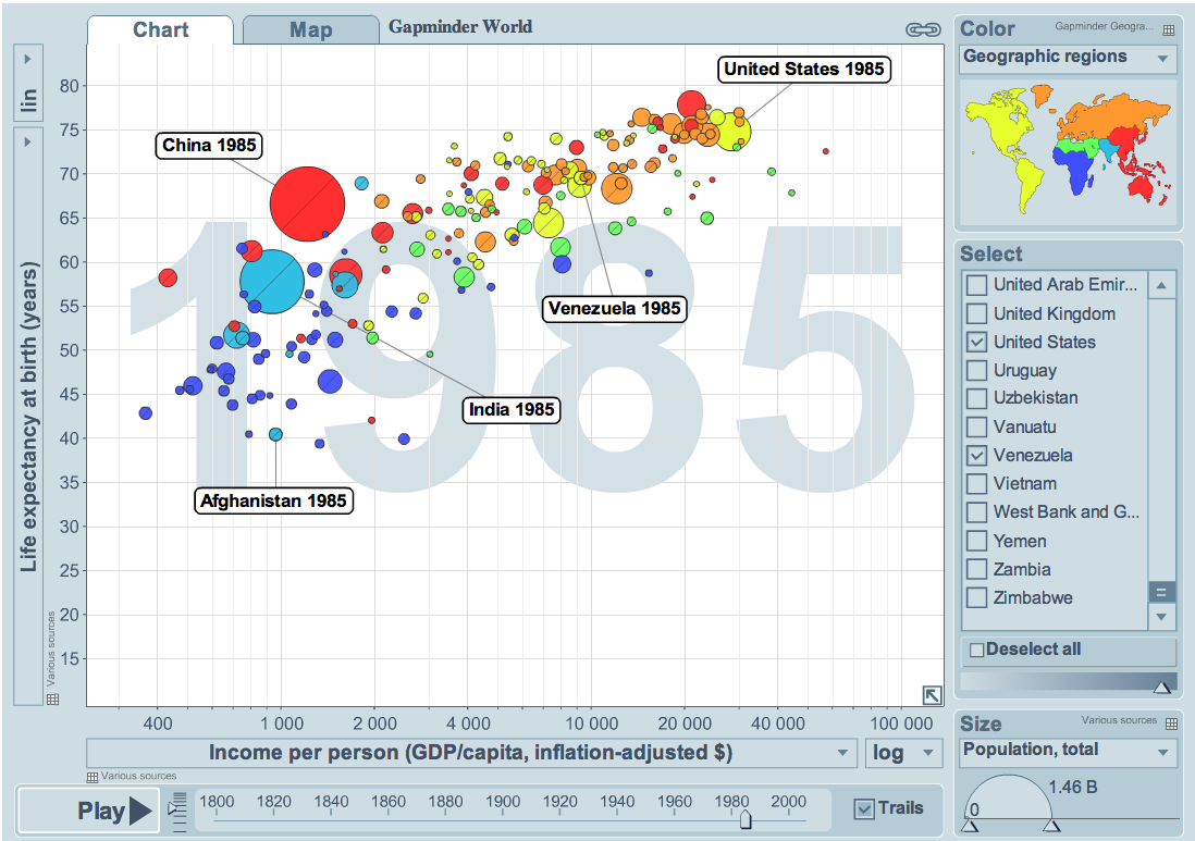
Knowing what data to pull, how to analyze it for patterns and trends and putting into a format where it can be used by decision makers is still the same, what’s different if the ability to get it to tell a story to the audience. My all time favorite master of data visualization is Dr. Hans Rosling, If you don’t know who he is, check out his site http://www.gapminder.org
Watching him in action is the best way to see why I think that analytics is more of an art then a science. You can have all the data in the world, and you can have great analytics talent working with it using cutting edge technology. But if you can’t use that data to influence your audience in powerful ways, then you are missing the boat.
