Staying Current with Analytics

Every few months I devote a day to discover what the current trends in analytics are. I do this both to refresh the slides in my presentation and to refresh my mind to see what I may have missed.

The amount of literature out there on analytics continues to blossom at an amazing rate, making it a true challenge to stay well versed on what’s hot and what’s not. I read a new analytics themed book at least once a month and I follow dozens of blogs, web sites and social media groups. Being well versed on what is current in analytics is a key to success.

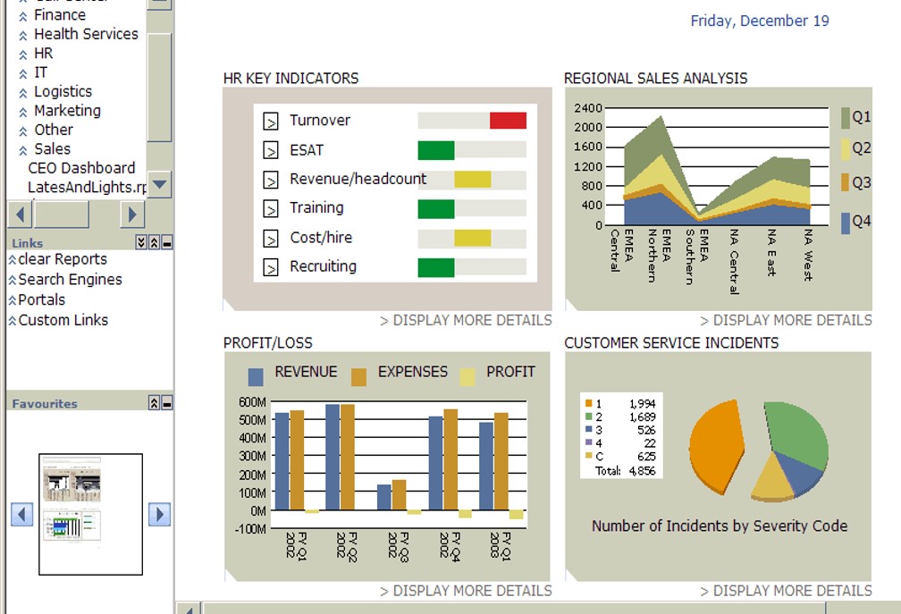
Every time I go to list the top 5 analytics trends, I find that some things change and some stay the same. Ever since I have been writing about analytics, data visualization is near the top. Business dashboards continue to be a big need. Business Intelligence (BI) tools evolve and new ones’ pop up, but Tableau continues to be a market leader.

That said, we are still squarely in an MS Excel dominated world. Upwards of 80% of Filipino professionals I recently surveyed still use Excel as their primary tool for data analysis. And even the ones who have dedicated BI tools, still use Excel for 75% of their analytics work.  The adoption of BI tools is trending upward, but the curve is still very step.

Another trend that has been on the upswing is how more and more data is now unstructured data. The discussion on what is unstructured data and how best to mine it and integrate it with structured data has really been at the forefront for a while now. Going from 80% structured to 90% unstructured in just a few short years as mankind generates unprecedented amounts of data not easily captured in a database every day.

As October 2018, if I had to pick 5 current trends in analytics to talk about it would be:
(1) How to Conduct Impactful Data Storytelling,
(2) The Analytics and Data Science Talent Shortage,
(3) Using Big Data Analytics for Digital Transformation,
(4) Optimizing Data Warehousing and Data Lakes,
(5) Which Tool Is Best; Tableau or Power BI, R vs Python, etc

And thats is not even touching topics that are on the cutting edge like machine learning, artificial intelligence and augmented analyst. Although those are super important to an overall understanding of how we can optimize data, these topics generally are several steps down the road from where my audience sits. They are still trying to master the fundamentals of business analytics and introductory data science.

So I spend a fair amount of time looking for YouTube videos or TED Talks  on these topics  to add to what i read.

The amount of information available to consume if immense. I guess as we have more and more data and more and more tools to analyze data, we will have more and more people writing about how to use data.

Its a fun time to be the Data Guy.

42650914_1540261689452602_6471348166867288064_n

DMAIPH – Decision-making, Analytics & Intelligence Philppines

Over the past few years businesses in the Philippines have invested heavily in big data, analytics and data science, but still have not achieved the expected outcomes of data-driven companies.

Based on our learnings from the 100’s of Filipino businesses and 10,000s of Filipinos who have taken part in DMAIPH Analytics trainings all across the country, we have crafted a proven,  non-technical approach to upskilling your team in analytics.

In 2019, we will be launching two new training programs: (1) Our DMAIPH Applied Analytics Master Class series for executives, leaders and decision-makers and our (2) DMAIPH Applied Analytics Boot Camp series for practicing analysts.

We will feature case studies of real Filipino run business, exercises based on actual analytics challenges being solved by Filipino analysts, and provide you with a copy of my book, Putting Your Data to Work, an analytics guidebook for the Filipino professional

Connect with us via our marketing partner, http://www.sonicanalytics.com to learn about upcoming analytics trainings and events. 

Advertisement

3 Key Tools Needed for HR Analytics: R, SPSS & Tableau

I get asked a lot about what are the best tools to use for HR Analytics. That is not really an easy question to answer as every company has needs a little different then every other company.

That said, the two most common in my experience with HR in the Philippines are R (including RStudio) and SPSS.

R is great for statistical analysis and visualization which is very suited to explore huge data sets.

It enables you to analyze and clean data sets with millions of rows of data. In addition, it lets you to visualize your data and analysis, like what you see below.

RStudio is an open source and enterprise-ready professional software package for R.

It basically does everything that R does, but has a friendlier user interface. The interface contains a code editor, the R console, an easily accessible workspace, and history and room for plots and files. You can take a look at an example of this below.

SPSS is one of the most commonly used HR analytics tools in social sciences. Thanks to its user-friendly interface you’re able to analyze data without having extensive statistical knowledge.

In addition, SPSS is often used within the field of social science. This means that a lot of HR professionals know how to use it, especially the ones with an interest in data.

Additionally, SPSS shares many similarities with Excel which makes it easier to work with.

Tableau is a business intelligence tool that is great at data visualization and business dashboards.

You can also learn to use Tableau to display data you process through SPSS to show results of predictive models.

So for companies looking take the dive into HR Analytics, these tools would give you a good base to inventory and analyze data using R, model it using SPSS and presenting it using Tableau

philippines_640

Analytics in the Philippines – The Philippines is at the center of the action when it comes to solutions to the global need for analytics. Blessed with a solid foundation of young, educated and English speaking workforce, companies around the world are look for Filipino analytics talent to fill analytics positions. DMAIPH was set up to facilitate these solutions and bring the talent and the business together. And that is exactly why I wrote Putting Your Data to Work, the first analytics guidebook designed specifically for the Philippines. Contact DMAIPH now at analytics@dmaiph.com or connect with me directly so we can help you take advantage of this unique global opportunity.

APEC Data Science & Analytics Key Competency #2: Data Visualization and Presentation

According to the APEC (Asia Pacific Economic Cooperation) Advisory Group, Data Visualization and Presentation is one of the key competencies of a Data Science & Analytics professional working in the region.

By definition, a DSA professional demonstrates the ability to create and communicate compelling and actionable insights from data using visualization and presentation tools and technologies.

Data visualization is a general term that describes any effort to help people understand the significance of data by placing it in a visual context. Being able to present these visuals in a way that initiatives action and empowers decision-making is just as important.

The best data visualizations are simply ones that take data and convert it to visuals like pie charts, line graphs, sales charts, etc.

Patterns, trends and correlations that might go undetected in spreadsheets or text-based data can be exposed and recognized easier with data visualization software.

Good analysts are the ones who can visualize data and use tools to add a story telling component to their analysis.

One of the best ways of communicating any kind of complex information is to turn it into a story, starting at the beginning and working your way through to the end.

Making the story relevant to the audience is key. By making the results both easier to understand and more likely to be remembered it becomes easier to convince an audience of the validity of your approach and make them more likely to accept and take action based on your conclusions.

In the end, just think of the adage picture is worth a 1000 words, just like a good pie chart is worth 10,000 rows of excel data.

IMG_9107

DMAIPH offers a wide range of analytics centric training solutions for professionals and students via public, in-house, on-site, and academic settings. We tailor each training event to meet the unique needs of the audience. If you need empowerment and skills enhancement to optimize the use of analytics in your organization, we are here to help.

Contact DMAIPH now at analytics@dmaiph.com or connect with me directly to set up a free consultation to learn which of our DMAIPH analytics training solutions is best for you.

Using Data To Recruit Better Candidates (Next Training Mar 28)

A few blog posts ago I mentioned 2 important recruitment analytics data points that can be used to help better understand attrition; distance to work and difficulty of commute. If a recruitment team has a way to use data on these two metrics in their screening process, they will be able to spend less time on high risk candidates and more time on candidates who have a much higher chance of sticking with the company.

It is not hard to start tracking these data points, as long as you have their home address, a general knowledge of traffic patterns and two very useful free  tools to help in your analysis. The free tools can be found at www.itouchmap.com and www.tableau.com/public

Based on the 50 Customer Care Analysts my team has hired for our 17 seat customer care team over the past 2.5 years, you can see some clear patterns when you look at their home addresses and commute on a map.

As you can see below, the majority of our candidates who turn into long term hires live closer to the office and along easier traffic routes. As a general rule, one direct ride (bus, train or shuttle) generally equates to stickiness of the candidate. Even some who live closer distance wise, but face multiple rides have a higher attrition rate than those who live a little further but have one ride. For example, taking a bus from the central part of Quezon City might be easier then 2-3 jeepney rides from Taugig, even though the distance from Taguig is much closer.

CS_Tbleu

The map, created in Tableau Public, is generated on knowing the latitude and longitude of their home address (from their resume), which can be looked on using itouchmap. The whole project took less then 2 hours to compile, organize and upload the data into Tableau, then seconds to build the map.

During our first year as we hired people from a wider range of places we had much higher attrition (65%), but as we matured as a business along with our understanding of these and other key metrics, our attrition has dropped significantly in the past year (28%).

As elaborated on more in detail in previous posts, distance to work and difficulty of commute are not on their own data points to be used to screen candidates, but when combined with their interview scores, test and assessment results and reference checks, you can have a much more well-rounded view of the candidate’s potential.

If you would like some help us setting up this same process of capturing distance to work and difficulty of commute and building a map to visualize them, feel free to reach out to me. I have a book, this blog, lots of training materials and I speak about analytics frequently. I’m here to help.

Our next training is March 14 in Ortigas, click here to learn more >>>

HR & Recruitment Analytics – The recruitment and retention of top talent is the biggest challenge facing just about every organization. You really have to Think Through The Box to come up with winning solutions to effectively attract, retain and manage talent in the Philippines today.

DMAIPH is a leading expert in empowering HR & Recruitment teams with analytics techniques to optimize their talent acquisition and management processes. Contact DMAIPH now at analytics@dmaiph.com or connect with me directly to learn how to get more analytics in your HR & Recruitment process so you can rise to the top in the ever quickening demand for top talent.

Big Data Analytics > The Art of Presenting Big Data


It has been my experience that presenting Big Data requires quite a bit of artistic ability.

I will be talk about the Art of Presenting Big Data among other topics at an event this coming February 21 in Ortigas.

For me there is a clear need to Apply a Process to Present Big Data Clearly
. This process has 3 parts.

  1. Selecting the Appropriate Presentation Format to Communicate Your Findings Effectively to Your Audience
  2. Mastering the Power of Enchantment
  3. Sharing Findings from Big Data to Drive Decisions Within Your Organization

Knowing How to Select the Appropriate Presentation Format to Communicate Your Findings Effectively to Your Audience is where we will stat.

To that end I have a checklist I use before every presentation I share involving Big Data:

  • Know Your Audience
  • Consider Time Constraints
  • How Will The Data Be Consumed?
  • Can The Data and Analysis Be Accessed?
  • Make it Interactive

DMAIPH offers a wide range of analytics centric training solutions for professionals and students via public, in-house, on-site, and academic settings. We tailor each training event to meet the unique needs of the audience. If you need empowerment and skills enhancement to optimize the use of analytics in your organization, we are here to help. Contact DMAIPH now at analytics@dmaiph.com or connect with me directly to set up a free consultation on which of our DMAIPH analytics training solutions is best for you.


DMAIPH – Junior Marketing Analyst/Administrative Assistant

DMAIPH is looking for a Junior Marketing Analyst/Administrative Assistant. This hybrid position is office based, full-time positions working out of our office in Ortigas Center, Pasig City, Metro Manila.

Set schedule with weekends off.

Duties include:

Marketing duties may include:

  • Social Media Posting
  • E-mail Campaign Blitzes
  • Internet Research
  • Data Entry/Encoding

Administrative duties may include:

  • Assisting with Payroll
  • Assisting with Time Keeping
  • Front Desk Receptionist
  • Buying/Picking Up Office Supplies

Successful candidate will be able to demonstrate a strong work ethic who is able to follow directions, can be at work on time every day and have good time management skills.

Requirements:

  • At least a basic comfort using Microsoft Excel for data encoding.
  • Previous work experience in sales, customer service, office work of service crew preferred.
  • An interest in graphic design to make simple online marketing materials.
  • Able to take directions in English.
  • A pleasant attitude and professional appearance.

Compensation:

  • Starting salary depends on experience, but the position base starts at 15,000 PHP a month.
  • After six-month probationary period, health benefits and paid leave will be made available.
  • Additional performance based incentives can be achieved.
  • Up to P2,500 in tax-free allowances.
  • Possible 5-10% performance bonus upon normalization.
  • Complete 40 hours of work. This is a full-time job commitment.
  • Annual performance evaluation and compensation increases.
  • Standard employee benefits as mandated by Philippine law.

This is not a sales or customer service call center job. 

Perks include going to job fairs, industry conferences, public trainings and in-house corporate trainings. This is not a typical desk job.

jobsPicture2.png

Analytics Jobs – DMAIPH hires, refers and connects Filipino analytics talent. The Philippines is at the center of the action when it comes to solutions to the global need for analytics. Working with DMAIPH to find work, hire analytics talent or set up analytics teams will ensure you are tapped into the best of the best when it comes to analytics in the Philippines.

Contact DMAIPH now at analytics@dmaiph.com or connect with me directly to find out how to take advantage of this booming opportunity.


Why Analytics Projects Fail – #12: New Technology

Occasionally one of the problems that can doom an analytics project is a new technology that emerges and makes the project obsolete before it is even implemented. This happened to me once when we were using an older and heavily modified version of Business Objects and then we got access to Tableau.

At the time, the flexibility of Tableau made our Business Objects business dashboard obsolete before we even completed the design phase of the project. The data visualization and the ease of use of Tableau Desktop at that time was miles ahead of anything our IT team could build around Business Objects. As a result, countless hours and dollars were lost, but in the end at least the business requirements we had established could be done by end users in Tableau.

Another example of how a new technology might impact your project is when a new version of the database you are using comes out. One that requires some much QA and/or testing to meet internal guidelines, that when it is finally approved it is hardly useful any more.  This can often be the case with big companies that have long vetting processes to use new version of software. You’d be surprised how many Fortune 500 companies are still running internal version of Windows XP because using 8 or 10 has not been approved yet.

Modifications done in house to off the shelf solutions can also make new versions incompatible. I have seen this happen with both Cisco and Teradata databases, where internal development of data flows and data structures to be so rigid, it was impossible to use updated versions of the same databases.

You can also come across situations where developers and IT teams are ordered to use something else because changes in a vendor relationships or a new strategy from the CTO.  In the end you have to adapt and either sacrifice, lose, or give up on what you have put into the project so far.

540

As the number of data collection and storage options grow, the complexity of data models surge and the types of business intelligence solutions increase, the likelihood of a big analytics projects being impacted by new technology. A good analyst has to stay up to date on what’s hot and new, in order to not advocate the use of something that is on its way to being a dinosaur.

To help me stay current, I follow several blogs and belong to a dozen analytics themed LinkedIn groups. I also try and attend at least one big industry conference a year as an attendee as well.  And finally I read a lot. I end up going through 3-4 analytics themed books a month. If you are facing a situation where you are worried your project might fall victim to a new technology, let’s talk about it. I can help you figure out a solution to keep you and your project on the cutting edge.

The key to using analytics in a business is like a secret sauce. It is a unique combination of analytics talent, technology and technique that are brought together to enrich and empower an organization. A successful analytics culture is not easy to create, but DMAIPH can show you how. Contact DMAIPH now at analytics@dmaiph.com or connect with me directly so we can build a strategic plan to turn your company into analytics driven success story.

Analytics Culture – The key to using analytics in a business is like a secret sauce. It is a unique combination of analytics talent, technology and technique that are brought together to enrich and empower an organization. A successful analytics culture is not easy to create, but DMAIPH can show you how. Contact DMAIPH now at analytics@dmaiph.com or connect with me directly so we can build a strategic plan to turn your company into analytics driven success story.

Q13: A lot of us want to know what is business intelligence and how does it add value to analytics?

Per Wikipedia, Business Intelligence (BI) is an umbrella term that refers to a variety of software applications used to analyze an organization’s raw data.

BI as a discipline is made up of several related activities, including data mining, online analytical processing, querying and reporting. BI can be used to support a wide range of business decisions ranging from operational to strategic as well as both basic operating decisions include product positioning or pricing and strategic business decisions include priorities, goals and directions at the broadest level.

The CHED memo breaks business intelligence into four phases:

  1. Data Gathering. Business analysts need to identify the appropriate data-gathering technique by conducting research. Once you have identified the right data, it needs to be captured. This process is the same as the identify process.
  2. Data Storing. A general term for archiving data in electromagnetic or other forms for use by a computer or device. There is a common distinction between forms of physical data storage is between random access memory (RAM) and associated formats, and secondary data storage on external drives. This process is akin to the first part of the inventory process.
  3. Data Analysis. The process of systematically applying statistical and/or logical techniques to describe and illustrate, condense and recap, and evaluate data is the analysis phase. Data analysis has multiple facets and approaches, encompassing diverse techniques under a variety of names. We need to have a data analysis to improve the company’s performance. This process is the 2nd half of the inventory process.
  4. Data Access. Data Access refers to software and activities related to storing, retrieving, or acting on data housed in a database or other repository. Two fundamental types of data access exist: sequential access (as in magnetic tape, for example) Data access crucially involves authorization to access different data repositories. Data access can help distinguish the abilities of administrators and users.

That is a good starting point to understanding the concept. The memo breaks down the data analysis process into 4 parts to show how important the structure or data lake your data is stored is as important as the data itself.

Business Intelligence tools all work based on the premise that you have structured data neatly stored in tables with header rows and columns of data. More advanced BI tools can handle unstructured data, but for the most part they are all built to pull data from structured environments. BI Tools are like a fish or depth finder to help you access your data from the data lake quicker and with more efficiency.

Another important point to note is that business intelligence and business analytics are sometimes used interchangeably, but there are different.

From my perspective, the term business intelligence refers to collecting business data to find information primarily through asking questions, reporting, and online analytical processes.

Business analytics, on the other hand, uses statistical and quantitative tools for explanatory and predictive modeling. In this definition, business analytics can be seen as the subset of an enterprise wide BI strategy focusing on statistics, prediction, and optimization. The CHED memo is more closely aligned to that division as well as the primary focus is on the storage of data and the use of modeling.

As for myself, I worked with business intelligence software and methodologies with Wells Fargo long before I had even heard of the term BI.

3.6.1

I want to leave you with on tip. If you are fairly new to the concept of business intelligence tools I suggest you download Tableau Public. It is very easy to learn, there is a very active user community to learn from and best of all it’s free.

So check it out.

Building Business Dashboards > One Of My Favorite Things To Do

Per Wikipedia, a business dashboard is “an easy to read, often single page, real-time user interface, showing a graphical presentation of the current status (snapshot) and historical trends of an organization’s Key Performance Indicators (KPIs) to enable instantaneous and informed decisions to be made at a glance.”

kpi-03

Whenever I talk to an audience about business dashboards, I always start out with this mouth full of an explanation. Because thats what dashboards do… they take a lot of complicated data and break it down into a few powerful visuals that provide insightful and actionable intelligence. Actionable being the key term.

My favorite dashboard builder is Tableau, and I instruct all my trainees to use Tableau Public (it’s free) to get some hands on experience in building dashboards. Qlikview is also pretty cool at building user friendly boards. There are several others that have free or trial versions. Gartner does and annual review of BI tools with a special focus on the ones who best provide an easy to use dashboard builder. Below is a sample dashboard.

db1

“Numbers have an important story to tell. They rely on you to give them a clear and convincing voice. ” – Stephen Few, the grandfather of Business Dashboards.

Social Intelligence Is A Competitive Advantage

Just came across a Tableau white paper and one of the top 10 business intelligence trends they talk about is how Social Intelligence is increasingly becoming a distinct competitive advantage.

tableau logo

“In 2014 we saw organizations begin to analyze social data in earnest. In 2015, the leading edge will start to take advantage of their capabilities. Tracking conversations at scale via social will let companies find out when a topic is starting to trend and what their customers are talking about. Social analytics will open the door to responsive product optimization.”

Per Wikipedia, “Social intelligence is the capacity to effectively negotiate complex social relationships and environments…[ it is social intelligence, rather than quantitative intelligence, that defines humans… social intelligence is an aggregated measure of self- and social-awareness, evolved social beliefs and attitudes, and a capacity and appetite to manage complex social change.”

So what is the social intelligence of your business? Are you managers and decision-makers looking at data to help them understand the social intelligence of your business? How do you measure social intelligence and start calibrating data?

These questions are exactly the kinds of things DMAI can help you with.